In the realm of data visualization, charts serve as essential tools to convey complex information effectively and intuitively. Among the diverse range of chart types, Bubble Charts stand as a powerful tool for data analysis, offering multidimensional fact representation. But what is a bubble chart? Below, we dive into the vital characteristics of this truly compelling tool.
Importance of Bubble Charts in Data Analysis
One might appreciate the added dimension Bubble Charts provide, but why choose them over other multivariate formats? The answer lies in their unique visual appeal and intuitive nature. Bubble Charts provide an engaging, interactive way to relay complex information, where larger bubbles naturally attract more attention.
Bubble Charts excel at depicting complex systems of relationships in an easy-to-understand form. Using size as visualization, they facilitate the representation of volume or magnitude, often used to exhibit economic phenomena or scientific data.
Moreover, by varying color along with size, Bubble Charts can display yet another layer of data, serving up to four dimensions of data analysis.
Breaking Down the Key Features of Bubble Charts
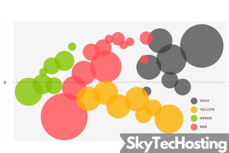
The standout feature of a Bubble Chart is its ability to visually represent three dimensions of data – two on the axes and the third by the bubble size. This unique feature makes Bubble Charts beneficial for comparative analysis and pattern identification due to their clarity and simplicity.
Bubbles are plotted on a grid, where their location is determined by their data point’s values on the two axes. Their size is determined by the third data point. Larger bubbles suggest a larger data value and are immediately more eye-catching, allowing crucial data to stand out effortlessly.
The color coding in Bubble Charts is an optional feature that can be employed to represent yet another layer of data or to distinguish different data sets visually. This color variation adds depth and detail to your charts, enhancing their information delivery.
Understanding these key features is the best way to effectively utilize them.
How To Effectively Utilise Bubble Charts for Your Data Sets

Alt Text: A series of bubbles floating upward.
The usage of Bubble Charts is not limited to specific fields or data types. They are versatile and can be adapted to suit various data sets effectively. The challenge lies in correctly using these charts to represent your data accurately and informatively.
Firstly, Bubble Charts should ideally be used when the data sets include three or four numeric variables. The variables should have a wide range of values, as this allows the size and positioning of the bubbles to vary significantly, enhancing clarity and understanding.
Additionally, the bubble’s size should correspond with the numerical value it represents, and color usage must be consistent and intuitive. Irrelevant or inconsistent color conventions can lead to confusion and misinterpretation.
Overcoming Common Challenges in Mastering Bubble Charts
While understanding and employing Bubble Charts may seem straightforward in theory, it comes with its set of difficulties. One common challenge is that bubbles can overlap, making some data hard to identify. However, having a streamlined organization and clear labeling can counter this challenge.
Secondly, bubble size determination can sometimes be confusing. It’s crucial to ensure that the area of a bubble (not the radius) corresponds to its corresponding data value. Misrepresentation of this scale may lead to incorrect data interpretation.
Altogether, Bubble Charts stand as a powerful tool in the realm of data visualization, offering valuable insights when skillfully utilized. By understanding their features and overcoming their challenges, one can significantly enhance their data comprehension and interpretation abilities.