Websites that are emerging here and there, to be precise it are popping everywhere. Not all of them are a remarkable success. A handful of them fails, while the others don’t. What could be the possible reason for that? Any wild guesses?
To answer the question the most frequent cause of such a site fails is not giving the demands of the users enough space to line up well with the thriving business idea. No doubt the idea is fantastic, but on the dull side if the user’s needs are not met it simply is of no use at all.
Any guess on how that can be eased?
The answer to this question is way too simple. It can be achieved only by achieving an overall perfection in the website design.
In this discussion, we are going to enlist some of those websites which won the hearts of millions of people as a result of perfection in design from the complete catalog of the eCommerce website database. These websites are an ideal example of what components are most needed for e-commerce website success.
Here are some of the most ideal websites out of which every one of them has got something which had them put ahead.
1. Rebecca Atwood
Website:- https://rebeccaatwood.com/
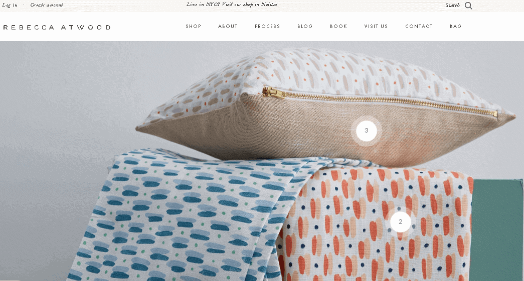
The well-known website does belong to Brooklyn. It’s more of a Brooklyn based textile (cloth) manufacturing and designing of the same website that majorly deals online.
The crafted product appears elegant not only just on a mobile screen but it also has a promising appearance on the desktop screens as well.
The layout of the website represents the product that is contemporarily in use. This, in turn, generates a self-improving mindset of the customer as the fresh products are being showcased and are in action.
This website has the same working, like an Instagram ad works, just like clicking on the promo or offer & a user is directly landed on a homepage of the product.
2. Modus Nutrition
Website:- https://modusnutrition.myshopify.com/
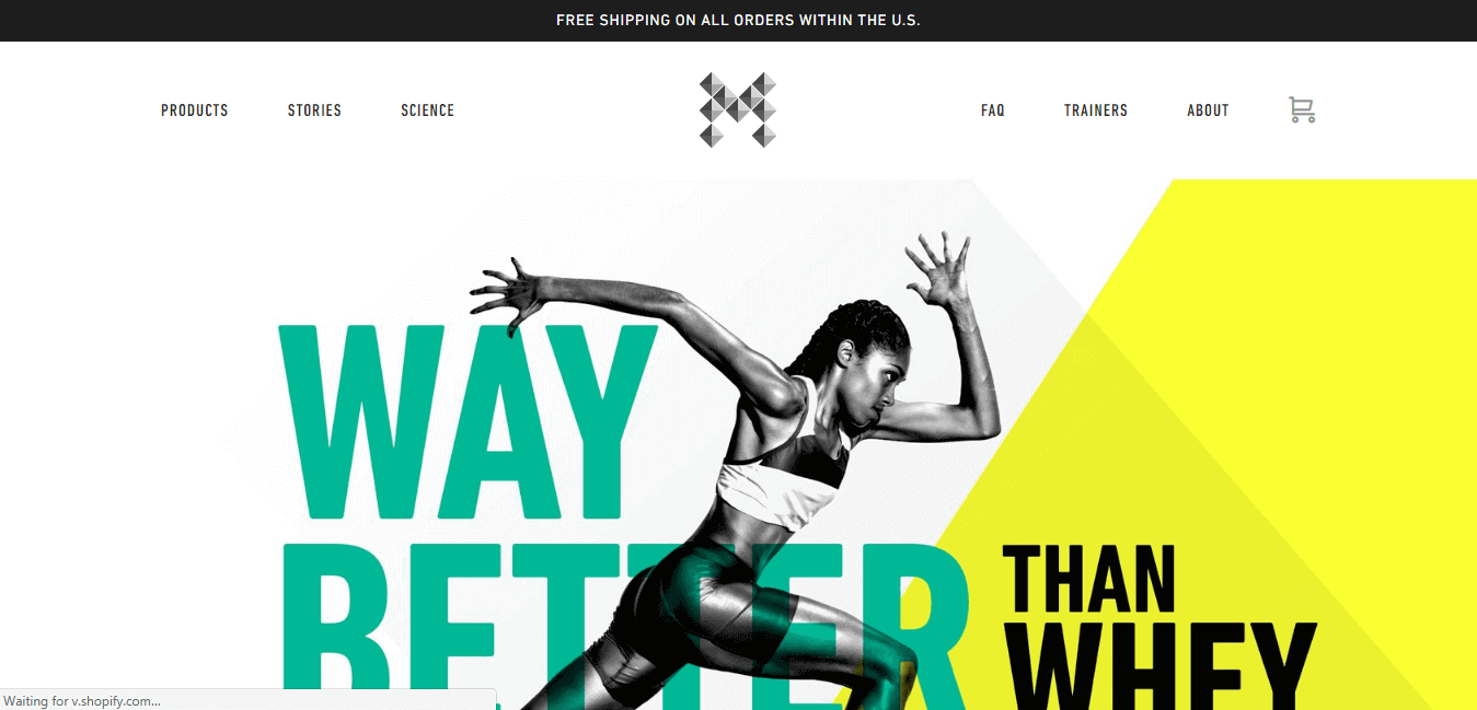
The homepage of Modus Nutrition only concentrates on the why and advantages of the product. Rather than covering a major share of the website page in promotion and offers for greater sales.
The website focuses on the above 2 mentioned pointers. What thrills the customer/visitors, even more, is that it has a channeled its attention on long scrolling.
This brings about something new to the user interface. This feature of the website is done so as to avoid tiring the user from going on scrolling continuously.
Fresh information is poured as and when the user moves down the website. This hence results in an elegant yet best eCommerce site web design.
3. The Sill
Website:- https://www.thesill.com/
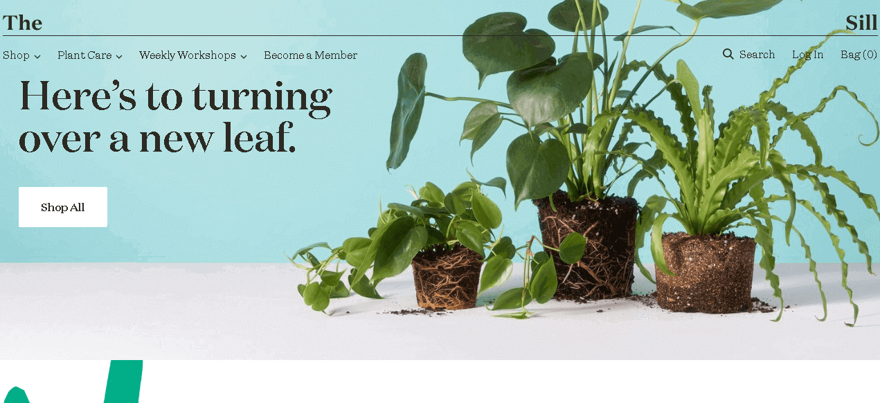
Along with the tempting and vibrant colors the website delivers a very neat and tidy yet convenient and blissful essence.
The Sill has a firm faith which marks the creative people and pleasant and so does the internet or web store. The complete site is a crispy and refreshing ambiance and has an elegant vibe in nature.
The menu of the header is very intelligent and it is considered as one of the most liked features on the register. The distance between “The” and “Sill” is so done with a motive to reflect the identity of the firm.
As a user scrolls down the site to observe the numerous products and those words compile and the alternate option is to the right hand.
4. Mulberry
Website:- https://www.mulberry.com/us/
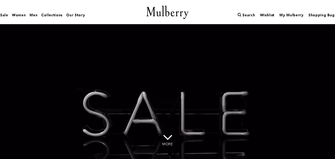
Mulberry is an audacious firm with a staggering best eCommerce website layout. On the website, it can be seen as magnificent vibrant colored pictures and lesser words with such sort of site blueprint.
A user if in search of a website blueprint which is of a high-end trend internet store where Mulberry kicks in.
The zoom attribute of the Mulberry is capable to go through the method of pictures attempts that the user to click on an item and marks the rich resolution standard of the imagery.
A user if is well versed with CSS or wants to surpass this to the website designer this might be it.
5. The Owl
Website:- N/A

The philosophy of the presence of the Owl on the list is the unparalleled takedown on e-commerce site layout.
The main page which we call or known as the ‘homepage’ is not like an ordinary top eCommerce website builders that we normally encounter these days.
It is obviously not a markdown as it places the web site as a creative one in the prospects which visit the website. The ultimate creativity provides aid to stand out from the crowd.
As moving along the Queue is not considered better as being a little different from the others and making own way.
The Homepage of The Owl is very simple which is later followed by a video that plays on its own as soon as the website is opened to mark the products in bold.
Additionally, it helps to grab an edge and nearly preferred by the majority of the visitors. Because of the simple layout of the website, the video does not strain much on the speed at which the page loads up.
6. The New York Times Store
Website:- https://store.nytimes.com/

The only thing which really turns the New York Times Store a standing element is the firm’s standalone and typography attribute.
The fonts used on the entire website do showcase the brand of The New York Times. The huge variety of product alternatives are placed or positioned in a neat and tidy grid interface which makes shopping and browsing a piece of cake. That means it could be done with ease.
The other most intelligent move of the site is that it bolds the typography for the remarkable sellers and the items which are in the sale is posed in a header which is quite sly and mechanically pulls the attention to the product
7. Beacon
Website:- https://beacon.schneidercorp.com/
Beacon is none other than a combined blueprint of an assignment which trades posters for a noble cause.
However, the website appears like an online art auction gallery. The products are showcased like the real posters which hang out on a wall. The layout of the site is minimal with some text and no excess menu bars.
With the help of some HTML measures, Beacon has managed to get the background images much more enhanced as it moves which helps to snag the user’s attention at a moment’s instance.
8. Baron Fig
Website:- https://www.baronfig.com/
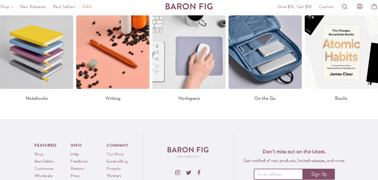
The website of Baron Fig is overflown with some majestic design components. One of them is to be simple photography which is minimal and sharp both.
The other element which falls right in is the thrilling graphics and capturing phrases used. The color pattern is directly related to product nature.
A user if in search of a site that uses a perfect combination of company tends to generate one tough ambiance then, The Barog Fig is the most considerable option to opt.
Somewhat relevant to the image of the homepage or the site main page, Baron Fig represents gets a rolling demonstration of a snippet from articles and firms such as Buzz feed, New York, and GQ which instantly snags on the attention of the user.
9. Caroline Z Hurly
Website:- https://carolinezhurley.com/

The magnificent and thrilling picture of Caroline Z Hurly’s main page configures the ambiance for how the rest of the website layout will probably turn out to be.
The thrilling and minimalistic photography taken into consideration to make an attempt to sell the product with not even making an attempt. The customers have not flooded byproduct alternatives.
On the main page of the site is clearly adorable to the product as it does not even come to the notice the camera is there.
It, in reality, separates from the normal and cheesy stock pictures of somebody smiling right at both, the user and product both at the same time.
10. Packwire
Website:- https://packwire.com/
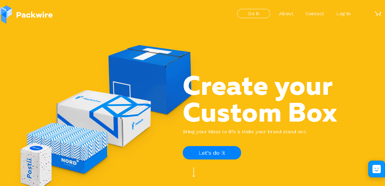
Going down the Packwire main page is a thriving trek where a user is unaware of what will be the next thing which is probably going to be next. The layout marks are entirely different as compared to some other e-commerce sites.
Packwire has successfully generated an adorable site for a not so adorable line of business.
Because of the difficulty to access layout and animations, as the page loads paces can be quite time-consuming in some cases. Anyways, Packwire has considered a box opening and closing itself to mark that the page is still loading.
11. Storm London
Website:- https://www.stormmanagement.com/
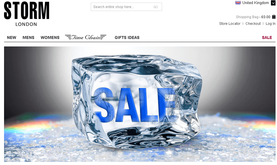
Storm London focuses entirely on showcasing the rich quality watches they have.
As long as a user is on the main page of the eCommerce site, they are welcomed with the details of each and every picture of the photo they go through or click on. The most appealing blueprint of the site is marked or highlight even the tiniest of the detailing to embrace the prospect buyer.
12. Beatific
Website:- https://beatific.co/
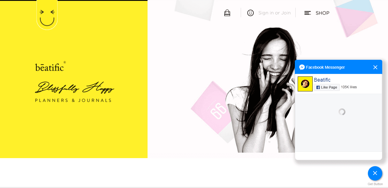
Being the best eCommerce sites of Beatific takes into consideration the extensive range of digital content like animations, photos, and illustrations to perfectly deliver their message. The color scheme and fonts generate a playful and young branding which is witnessed in the entire website.
13. MSMG
Website:- https://msmgtoolkit.in/
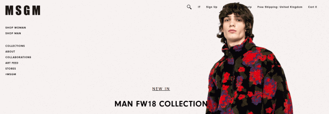
MSMG is the conventional version of utilizing a handful of photos and vibrant color scheme. What really interesting about the MSMG is that the Mouse cursor is transformed into an M?
Yes, it is really much of the classic stereotypes from the early 90s. But the fact which is lesser known is that people as of now are in deep love with the classic or nostalgia elements or components.
14. Wolf Gang
Website:- https://wolfgangusa.com/
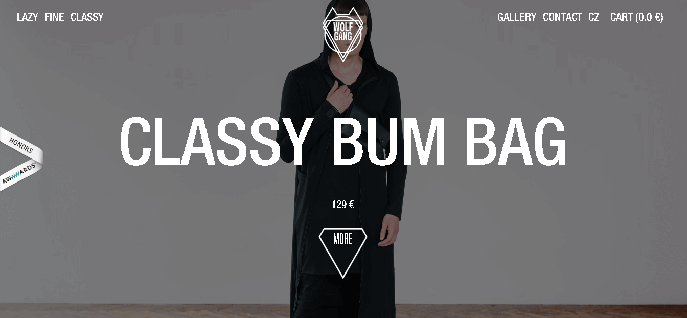
The only thing which has successfully resulted in the site’s success is the heavy and dark design/layout.
The majority of the website opt to a more colorfully vibrant blueprint with eye-catching colors.
But herein Wolf Gang moves in the opposite direction. The typography or the method in which the words or content appear is way too bold and right on to the face which makes it even more acceptable on a much wider scale.
15. Two Chimps Coffee
Website:- https://twochimpscoffee.com/
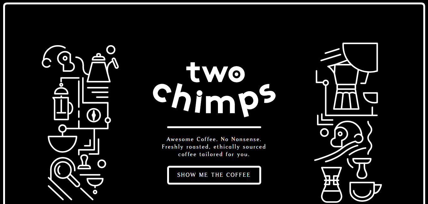
The brand’s oneness and solitude is represented as the two chimps that are the primary center of attrition.
The menu of the hamburger has one of a kind layout which is hard to come across these days.
The site is overflown with a number of unique attributes. A user when makes an attempt to abandon the site when a prompt pops up with a unique message that is hard to see “Please Don’t Go. It is backed with a CTA which is better known as Call to Action.
It conveys a message that states “Please Gimme Some” is not that amazing? It is something that captures the user’s heart and stops a major chunk of the traffic that drifts off the site.
16. A.N.Other
Website:- https://an-other.com/

A.N.Other site takes into consideration a sticky button which sustains the company or firm’s name and center despite of whatever place you hover but on the website.
The entire design or blueprint which is used for the complete website is very classic and is hard to fade off from the minds of people. It provides the user a grab sort of layout which comfortably pulls the eyes of the user from one to the next thing
17. Sense6
Website:- http://www.sense6.com.au/
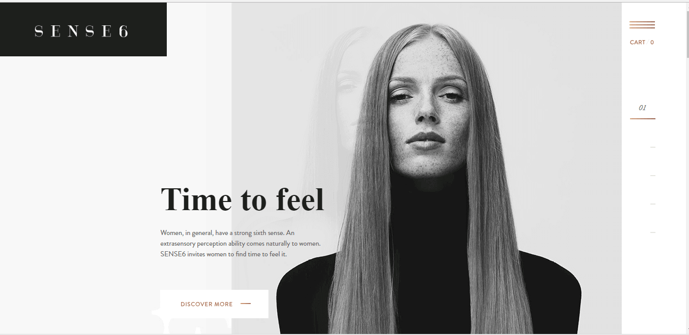
Sense6 falls short of color. It completely turns it something that could steal the show. The complete site is covered in a fair combination of black and white. The other thing about this site is that it has very few colors that are used on this site.
18. Manolo Blahnik
Website:- https://www.manoloblahnik.com/us/

Manolo Blahnik has a motive that continued for the past 40 years as the site has a need to mirror how precious they stand.
The page when scrolled it represents a catwalk that is focused on sustaining their brand prestige. Manolo has generated a shadow that impacts a feel for the products on the contrary. It is completely unique and out of the box
19. Native Union
Website:- https://www.nativeunion.com/
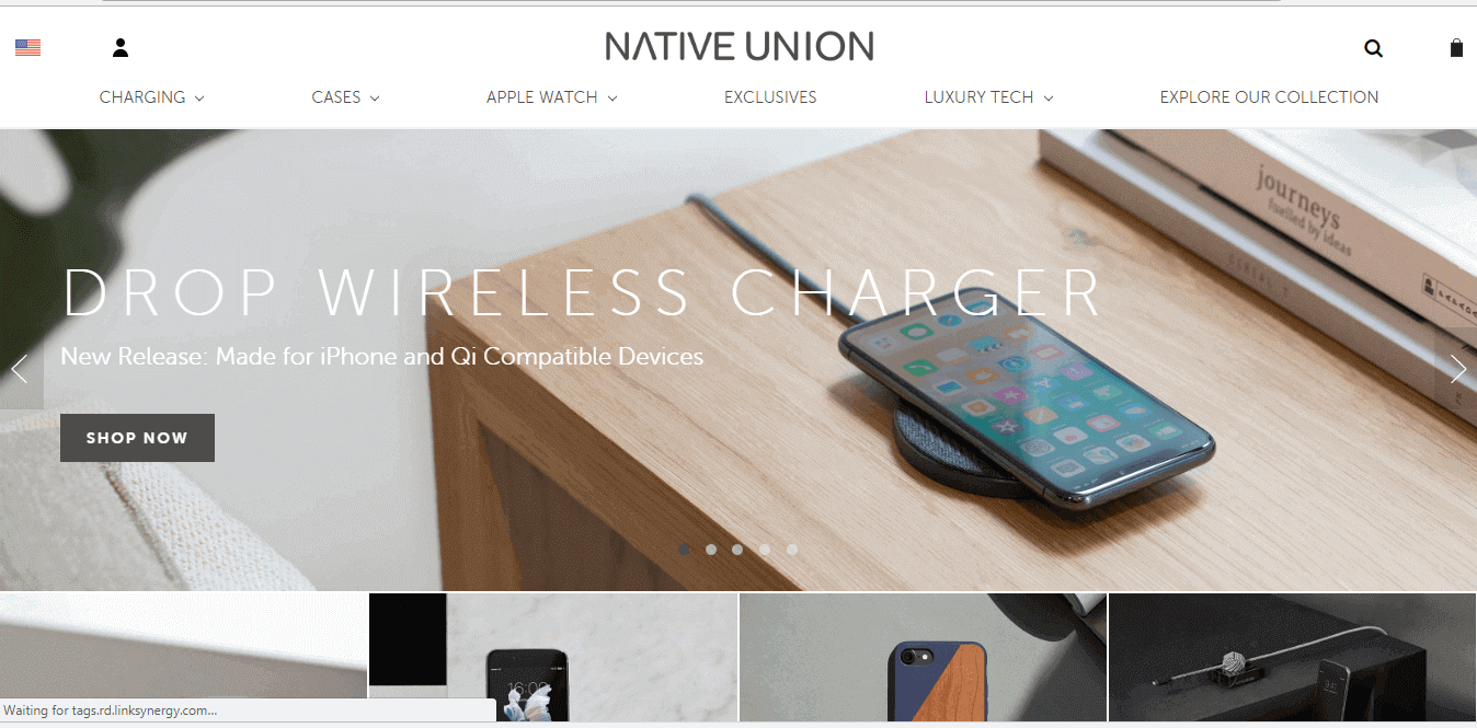
The banner of the site is a slider that looks great and makes the site a much representable site for the visitors which engages the audience visiting the site for the first time.
Images used in the entire site is very much attractive and of crowding pulling. It represents the product in a completely different manner. As it displays the product and leaves the user with a few questions, which keeps them engaged on the site.
20. MyFelt
Website:- https://www.myfelt.com/
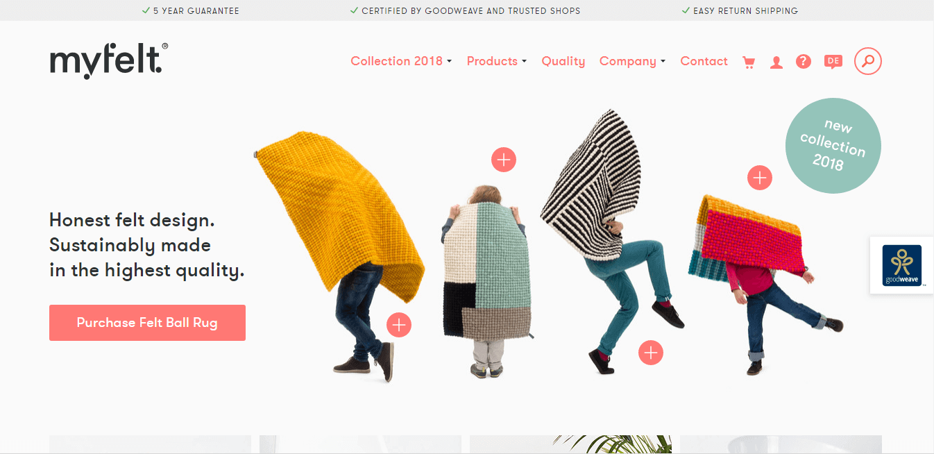
Photography is considered as the most vital element of namely any e-commerce site. The comical and cute photos are responsible for making it even much more preferable.
The photography which is used really tunes up the user experience to next level.
21. Kaffefamiljen
Website:- https://kaffefamiljen.se/
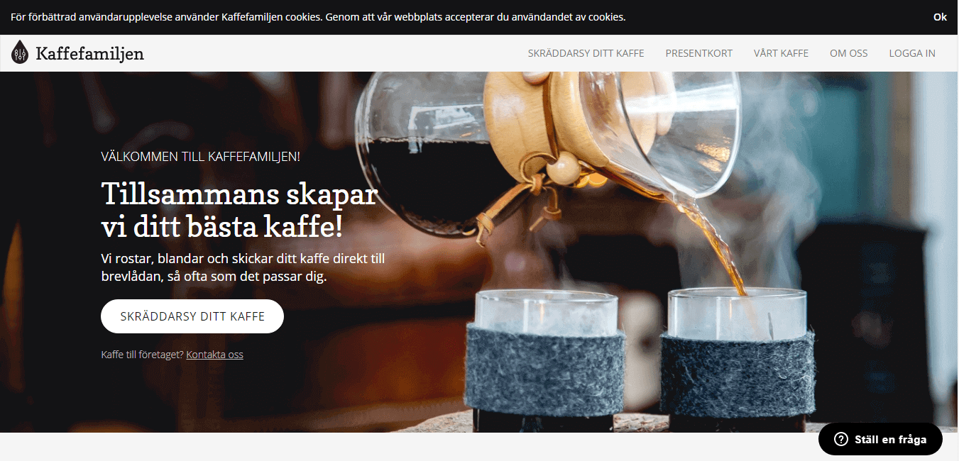
The info graphics which is used on the site is very interactive. And on the other hand it is a very impactful and smart move by the site designers to entail a line of business.
It eases the work for the customers to make it comfortable to look at. An ideal example of perfectly designed and layout infographics to keep the user engaged.
22. Michael Petrov
Website:- https://www.mpetrovcello.com/

The layout of the Emersion is simplistic and yet stunning. It marks the various scrolling pages in a unique way. Every page that is alike and a tiny amount of illustrating and text.
The slight or say handful design components are able to create an off the hook experience for the site visitor.
23. Burren Perfumery
Website:- https://burrenperfumery.com/

The site named Burren Perfumery depends greatly on the lifestyle standards of the products they sell. The combination of pictures used can be a plus point.
The main page of the site layout is composed such that the users end up buying their products.
24. Via Copenhagen
Website:- http://viacph.dk/
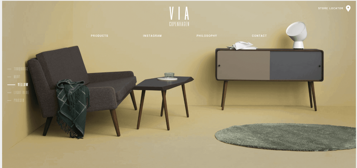
The Via Copenhagen MainPage does not scroll like the other numerous websites of eCommerce.
The site is rather very elegant while, on the other hand, numerous products keep on jumping from one to another page on and off the screen. The color scheme is very eye-catching to be precise.
25. Save Khaki
Website:- https://savekhaki.com/

The Save Khaki’s blueprint of the site is very simplistic with a firm examining the photos used. As the photos adjust completely with the webpage.
It keeps changing at a regular interval of time. It also integrates a combined messaging platform and provides the impression that the site is focused more on representing and less for selling.
26. Buffy Comforters
Website:- https://buffy.co/
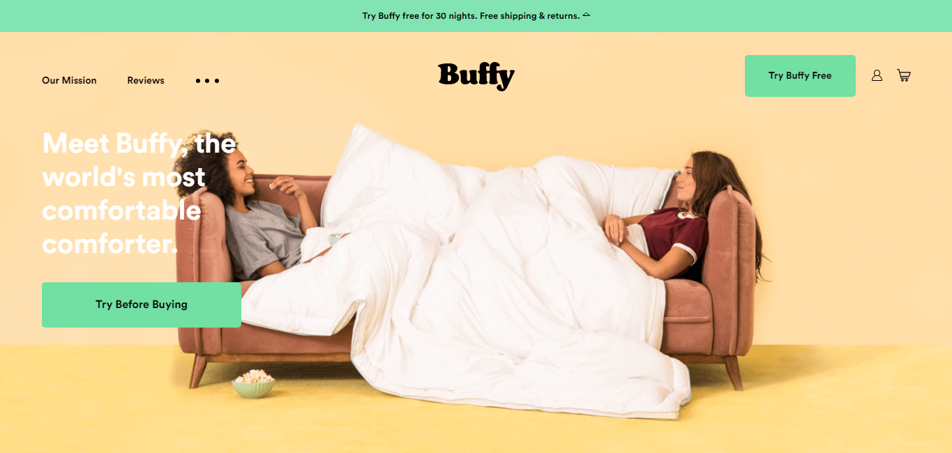
The Buffy Comforters photo which is displayed in background appeals to the user to grab a couch and keep moving across the entire site of Buffy Comforters.
The site claims to have the softest, fluffiest and softest comforter one can ever think of. The product sells off with the least trouble if you believe.
27. 450GsSM
Website:-https://www.450gsm.com/
To be precise the 450GSM is less of a fancy site. Concentrates more on being ideal and practical in its line of business. It is overall an average but impactful looking site.
As it is the site’s concept of believing that being simple is the best. Also to navigate and keep steering from one page to another is not much that this site cannot do without hesitation.
28. Only/Once
Website:- N/A
The design of the only/Once is classic and the elements used are quite catchy. The various classical elements used are arranged in such a manner that makes the browsing much comfortable.
The whitespace used around each and every product gives the site a very spacious look, unlike other fluffed up site.
29. Aesop
Website:- https://www.aesop.com/us/

The Aesop concentrates on the nature of the skincare as it is their line of business.
It comprises a range of close up pictures of the packaging and products. The site is an ideal example of how well the term photography is used on skincare and beauty products in a simple way.
32. MAKR
Website:- https://makr.com/
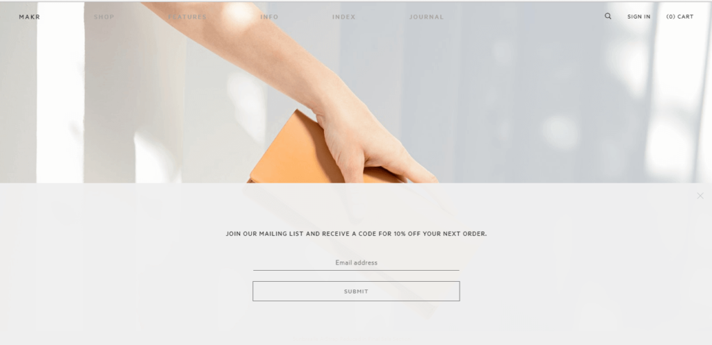
The landing page of Makr is made in such a way that it is able to keep the users engaged because of its interactive feel all-around. The leather product in which the site results in the spark causes the user to end up buying the leather product. As when mouse pointer product hovers the product pops up as it came to live.
33. 42/54
Website:- https://www.4254sport.com/
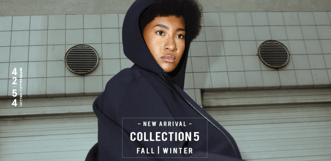
The 42/54 utilizes a set of the thriving and vibrant color set which is an added advantage. The site does not avert from showcasing the elegant background color scheme. The website is very light which causes the site to load up faster along with the eye capturing colors and tiny accents.
34. Simply Chocolate
Website:- https://www.simplychocolate.com/

The blueprint of Denmark based chocolate giant eCommerce store has ample space which provides enough space for each and every product to have their piece of space to represent perfectly to the user.
35. Dimension Volumes
Website:- https://dimensionvolumes.com/
The most observable thing about this site is that the Dimension is elegant in typography used across the site. The magnificent font is splendid and generates an eye-catching appeal to any visitor to the site. Hence helping the site to stand apart from the hundreds of other eCommerce sites around on the web.
36. Teenage Engineering
Website:- https://teenage.engineering/

The site has a remarkable website layout in engineering. It appears exactly how it should be and what an engineering student might expect it to be like. The black and white colors used make it very sound.
37. Vipp
Website:- https://vipp.com/
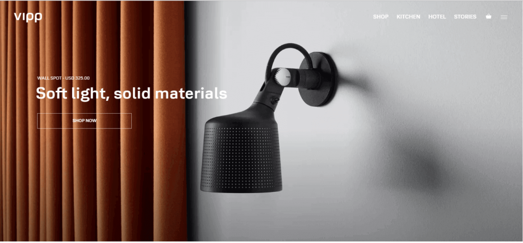
It is a site that deals in selling off small household items. The site has a simple design and the products are perfectly organized. A handful of fancy attributes packed with some basics.
38. Staud
Website:- https://staud.clothing/
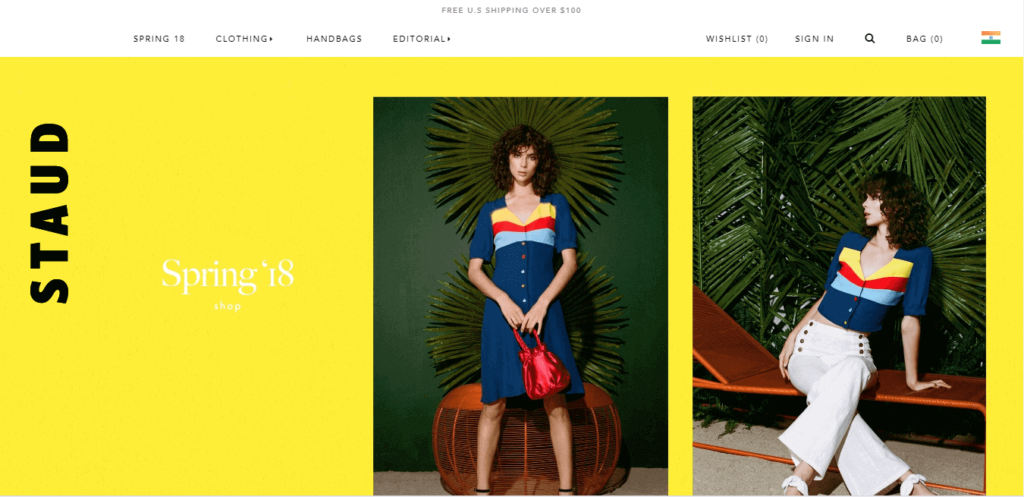
Staud is the perfect sample of how an eCommerce site should be. Using vibrant colors, the photos are arranged perfectly for the product to be featured on the site.
The text is a combination of simple black and white, and the balance is perfectly maintained.
39. Mallika Favre
Website:- https://www.malikafavre.com/

The site completely eradicates the excess use of white spacing and makes use of vibrant color combinations with thrilling graphics. It covers the entire screen. Being memorable and creative is the added advantage of being liked more by visitors.